Characters and Words
Text as a Charge
You can use arbitrary text as a charge and also arrange that text in various ways. The whole of a text is treated as a single charge, so it can be placed and arranged as required on the shield.
Here is an example of a charge containing some arbitrary text:
the words "Fidus et Audax" gules
Note that it is followed by a tincture, just like any other charge, and it may be described as proper, in which case it will tinctured sable. It is important to enclose the words in quotation marks to group them as a single item. You can also include any punctuation characters required - if you want to include quotation marks in the text itself precede it with a backslash. You can use phrase or saying instead of word. Within the text most accented characters are available but non-latin character sets and emojis are not supported.
There is no in-built limit to the length of the text, it will simply be displayed at progressively smaller sizes.
Arrangement of Words within the Charge
By default, DrawShield will show the words in a horizontal line. You can change this by using one of the following modifiers after the text:
- disposed in fess - (default) words are arranged in a single horizontal line
- disposed in pale - words are stacked vertically
- enarched - words are placed along an upward curve
- embowed - words are placed along a downward curve
- wavy - words run along an upward then a downward curve
- encircled - words are arranged in a complete circle, starting from the "9 o'clock" position
Arranged is a synonym for disposed. You can also use disposed in a circle instead of encircled.
Arrangements in Pale
When words are arranged disposed in pale they may be further modified by any one of:
- laying to the sinister - alinged to the sinister edge
- laying to the middle - equally spaced either side (the default)
- laying to the dexter - aligned to the dexter edge
Special Form of Encircled
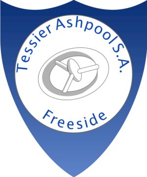
Rather than placing all the text in a circle, which can be difficult to read, the encircling text can be split into two parts, using the keyword opposite. the first part will occupy the upper half of the circle and the second part the lower half but all the text will be "upright". See the example below.
Styling the Words
By default text will be shown in a formal, serif font, but this can be changed using the keyword styled to produce different styles of character drawing. Currently supported styles are:
- plain - simple characters without serifs
- serif - the default
- cursive - as if hand-written
- carved - as if carved in wood
- engraved - as if engraved in stone
- gothic - nice crinkly edges but not always readable
Not all accented characters are available in every style, the serif style has the largest number of different characters available.
Example Blazon
grady inverted azure
a roundel argent
the phrase "Tessier Ashpool S.A." encircled
opposite "Freeside" azure styled plain
a space station argent in cross point shown smaller
(I am aware that Freeside is actually an O'Neill cylinder. Perhaps this was an earlier incarnation.)
Indivdual Letters and Digits
You can also use a single letter, or a short string of letters as a charge using the construction the letter "x". The letter may be styled using any of the styles above, gothic can be particularly effective. Unlike "words", these letters are larger and therefore have strokes, you can control the colour of the stroke as usual with stroked colour.
You can also construct monograms from 2 or more letters using the monogram "KrW". This will display the text with the next letter overlapping by half the width of the current letter. This mostly works but gothic styled monograms are largely unusable. Note the use of the lower case centre letter, which can be quite effective. Monograms can be stroked like letters.
Finally, you can also specify digits, using the construction the digits "1972". Again these can be styled and stroked as required. Note also that you can specify the number in words the number "Forty Two" will appear as "42" not the words.
(Previous Versions)
There was an earlier implementation of "word" charges which used a more font-based approach but it didn't really fit with the heraldic theme. The previous implementation is still recognised and either automatically converted to the current form or an error message is generated if a feature is no longer supported.
